Live Show Icon Navigation: Streamlining Engagement on Revo Video’s Platform
Social Commerce
Mobile Browser
2023
Overview
Background
As the platform expanded, so did the available on-screen features, leading to a cluttered and visually unbalanced mobile interface. The lack of hierarchy and unclear primary actions posed a threat to user engagement and brand performance.
Being conscious of the impact of choice complexity on decision-making, our goals were to balance the visibility of core features, prioritize key actions, and maintain consistency with existing mental models.
Reflecting on where we were at
To identify where we currently stood and gauge how users perceived the live show experience, we relied on internal testing.
Revo’s user base was small, with analytics integrations being no where in sight in the near future. That being said, we were constantly looking to improve and wanted to do so outside of our typical way of competitor analysis. For this, we considered testing internally within our company.
As our primary user group was heavily reliant on the target audience of the brands that we worked with, our users ranged anywhere from techy-savvy Gen Z’s that loved to shop online to middle aged people who were more likely to shop in person, with the occasional online purchase.
Keeping this in mind, we felt that testing internally would allow us to refine and validate iterations quickly.
What did we find?
From our our conversations with the team, the key insights were:
Overcrowded Icons: The number of visible icons was overwhelming, especially in a live shopping setting where users need to make quick decisions.
Low Discoverability: Actions often went unused simply because users couldn’t find them in the interface.
Th previous view of live show actions
Balancing Brand vs Customer Priorities
From a brands perspective, key actions were those that encouraged people to make a purchase. This was similar to the customer sentiment of wanting the shopping experience to be as seamless as possible.
Secondary actions were those that aided in user engagement with the brand. These included things like “Like”, “Reactions”, “Comment”, “Share”, etc.
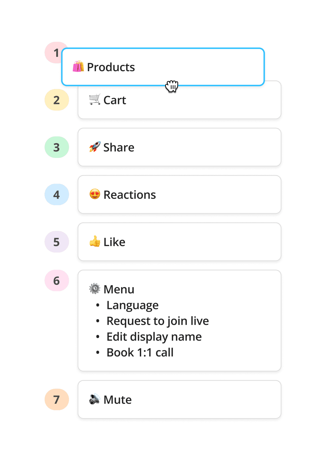
So, we elevated actions like “View Products” and “Cart” to be high-priority and would look to make these actions more prominent and accessible.
Feature Pioritisation
Solution Breakdown
Identifying Key Actions: The placement of icons was reorganized based on the most commonly used features, ensuring high-value actions were immediately accessible.
Minimizing Visual Clutter: Non-essential actions, such as settings and additional features, were moved into collapsible menus to declutter the primary view.
Micro-interactions: Subtle animations were introduced to provide additional emphasis to actions.
Little Big Updates with Micro-interactions
Microinteractions
Putting It All Togehter
The Final Solution
Other Iterations
Along the way, we explored several other design iterations, such as simply removing redundant actions, making room for more actions on the bottom nav by replacing the chat field with an icon and many more. However, these versions felt lacking and led to mixed feedback in usability tests. The collapsible menu version ultimately emerged as the most streamlined and effective option.
Iteration 1
Iteration 2
What We Could Have Done
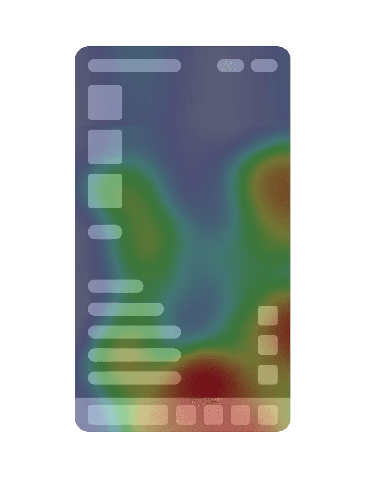
Given the small user base and time constraints, we weren't able to employ advanced analytics tools, but in a larger setup, we would have utilized heatmap analysis to track user interaction in detail. This would have provided deeper insights into which areas of the interface users interacted with the most, allowing for more data-driven decisions.
Results
The revamped icon navigation led to:
Increased User Engagement: Interaction with primary actions increased.
Improved User Satisfaction: Feedback from post-launch surveys indicated users found the interface much easier to navigate.
Reduced Time to Action: Time to access key actions was reduced, allowing for quicker engagement during live shopping events.
Final Thoughts
And that's a wrap! 🎉 This project served not only served as reminder to embrace the “less is more” mindset while designing but also the impact of micro-interactions in enhancing the overall product experience.